Data Visualization: The Financial Crisis Through Bank Failures By Matt Starr and Charlie Betts
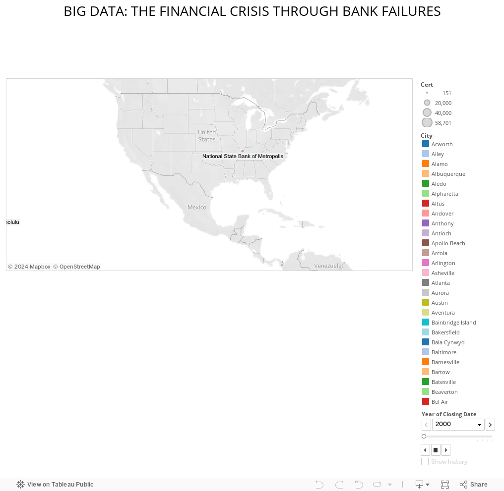
For our data visualization, we really wanted to tackle a political component, given the upcoming election later this year. While we initially headed in the direction of representing bipartisan perceptions of the United States’ role in foreign affairs, we had to abandon ship on that idea due to both an insufficient data set and a fairly limited adeptness in coding software. While we had to do a bit of a 180, we still decided that we wanted to generate something within the political sphere. What we ultimately ended up creating was a straightforward geo-spatial time lapse that tells the story of the 2007-2008 financial crisis through the failure of federal banks from 2000 to present day.
We were able to accomplish this project by importing a data set from the Federal Deposit Insurance Corporation, filling in the necessary gaps in data—about 200 values worth—manually as needed, according to the data set itself. Each color-coded blip on the map directly represents a failed federal bank by geographic location. Additional information, such as the name of the bank and the date it closed can be found as well. We’re confident of the strong correlation that the visualization shows, given that the volume of bank closings seem to coincide with the 2007-2008 financial crisis, peaking from 2009-2011, and dwindling down in the years since as the country recovers. With the contemporary economic and political climates as they are today, we find this topic to be especially interesting and relevant.
Please note: there was a play function in the Tableau workbook; however, it seems to have disappeared in the transfer to Tableau Public. Using the guided arrows at the bottom right of the visualization should essentially do the same thing.
Big Data: The Financial Crisis Through Bank Failures
 Previous Post
 Next Post