Data Visualization Project (w/ Nisha Vaidya and Samantha Price)
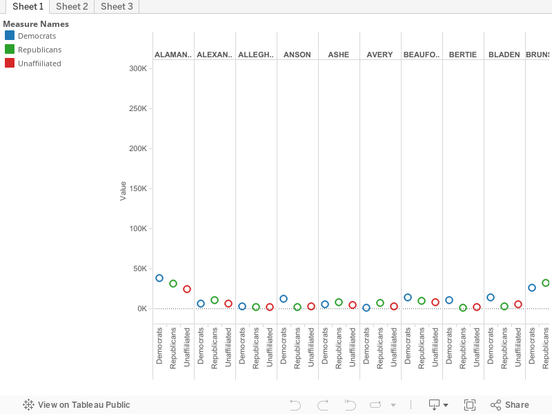
Our data visualization is on the voter statistics of every county in North Carolina. Especially because of this election year, we wanted to take a look at voting statistics based on gender, ethnicity, and party affiliation, as well as by county, and finally as a state in whole. We utilized the program, Tableau, which is a program that allows users to create and share visuals of data analytics. This program allowed us to make an easier to digest visual interpretation of data open source data that we found in spreadsheet form. We ARE submitting this to the Code+Art competition.
 Previous Post
 Next Post