Data Visualization: College Graduation Rates by State
Group members- Cheyenne Taylor, Ellen McMullen, and Ward Williams
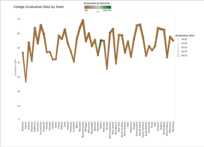
Our topic for this project is comparing college graduation rates by state. We chose Tableau because it allows for a simple but clear visual. We chose the x-axis to be each state in the United States, and the y-axis for the graduation rates. Each point on the graph represents the average graduation rate. When clicking on a point it will also give you the number of how many students were graduated by the summer of 2009. The thickness of the lines increases based on how much higher a state’s graduation rate is (i.e. thinner lines are lower on the chart). The part of the chart that’s green is colored differently not because it’s the only one that isn’t a state, but because is has the highest number of people who graduated by the summer of 2009. The graph originally started as a scatter plot. We then changed it so that the circles are no longer lines. Our graph resembles a mountain, and much like a mountainous peak, a higher graduation rate isn’t necessarily an indicator of the top school, if anything it could make it harder to reach.
https://public.tableau.com/profile/publish/Book2Project/Dashboard1#!/publish-confirm
 Previous Post
 Next Post