Data Visualization of English as a Second Language Speakers
Since I had trouble embedding the file where it would work in the blog even after watching the tutorial several times, here is the link:
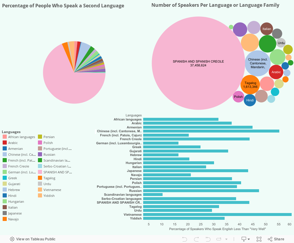
The data used in this visualization was gathered by the United States Census Bureau and concerns languages spoken in the home across the U.S. and self-reported English speaking ability. The data is publicly available here: http://www.census.gov/data/tables/2013/demo/2009-2013-lang-tables.html
Using Tableau, three graphs have been created which aim to show the amount of speakers of each language and the percentage of speakers of each language who have reported that they do not speak English “very-well.” Through the visualisation of this data, we are hoping to raise questions in our audience about why certain languages see a higher percentage of speakers who do not speak English “very-well,” and the possible socio-economic, historical, and linguistic reasons behind this.
Group Members
Alexandra Goodfred
Katie Hartley
Margaret Mainguy
Kayla Akers
 Previous Post
 Next Post