Data Visualization Project – Bullying in School
Group Members: Sarah Izzell and Emily Hines
Click here to access the link for our project.
We chose to do our data visualization project based on open data compiled by the National Center for Education Statistics. The data ranged from 2005-2013 and included eight categories of bullying broken up into five categories of student characteristics including: sex, race, grade, control of school, and location. We decided to create a visualization based on control of school, sex, and race, and chose four bullying categories. We chose the more extreme bullying categories that included either physical harm or the threat of physical harm, and as an overview, the total bullying instances. We also chose the years 2005 and 2011 to see how the data changed over a longer period of time. We expected to see bullying rates continuing to increase with the influx of violent media kids are exposed to; however, some categories actually decreased from 2005-2011. When we attempted to embed our project some of our visualizations lost their original placing, so you will also see a screenshot of our project in the photo for this post. We are entering our project in the Code+Art project and hope that our visualization project will result in conversations about how to protect kids from bullying. 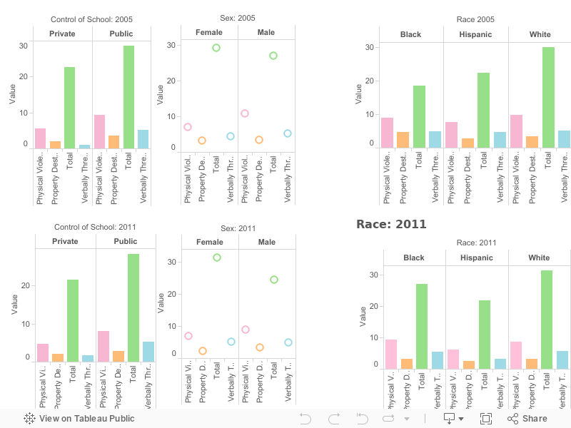
 Previous Post