Data Visualization: Poverty and Obesity in North Carolina
Group Members: Julie Gareton and Brooke Wilner
Note: clicking on the image will enlarge it. The embed code doesn’t quite work properly for ours, so to view it on Tableau click here.
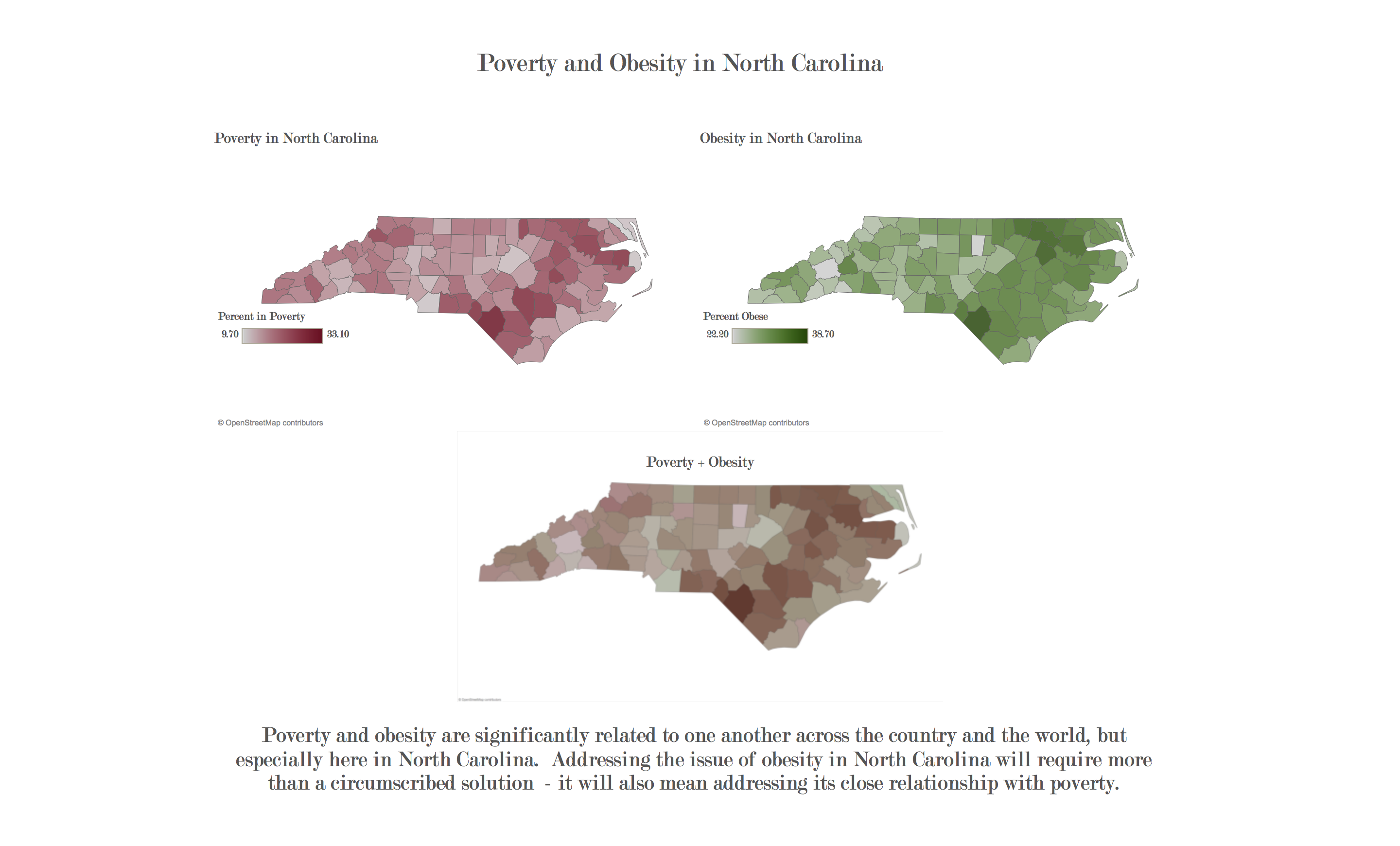
Our simple data visualization project focused on the strong correlation between poverty and obesity in the state of North Carolina. The three maps shown each have the counties of North Carolina shaded in: the first map displays the rate of poverty within each county; the second map shows the rate of obesity in each county; and the final third map overlays the previous two maps on top of one another. By overlaying the two maps, it becomes immediately clear that those counties with the highest rates of poverty correlate very strongly with the counties with the highest rates of obesity. At the bottom of the visual is a brief call to action and thought for those who view it; we consciously chose to have few words on the project to help it appear less cluttered.
We chose this project because both of us have interests in human health and hunger advocacy, and also to address a common misconception in American society. Those who are obese are vilified as making poor choices for their own health, as if obesity is a single, straightforward issue that is simply addressed. In reality, those who are obese are often from poorer backgrounds than those who have remained at healthy weights for their whole lives; this is true in part because of the relatively cheap price of unhealthy food when compared to healthy food, and because of the high prevalence of food deserts (areas where little to no opportunities for purchasing healthy food within a reasonable distance exist) in low-income areas.
Further, we chose North Carolina to remind those looking at the project (who, because of the location of the Code+Art competition, are likely North Carolinians) that these kinds of issues do not only exist throughout the country and the world; they also exist right here at home. By depicting North Carolina directly, and including a brief call to action at the bottom of the visual, we hope to encourage those who view our project to think more constructively about ways to effectively address the growing issue of obesity.
The data for this project was taken from 2013 reports from the United States Department of Agriculture (USDA), the US Census, and research from Feeding America.
 Previous Post
 Next Post