Social Network Analysis: March Madness vs. Politics
[Project By Emily Hine, Charis Yarboro, Sarah Keener, & Meredith Vertrees]
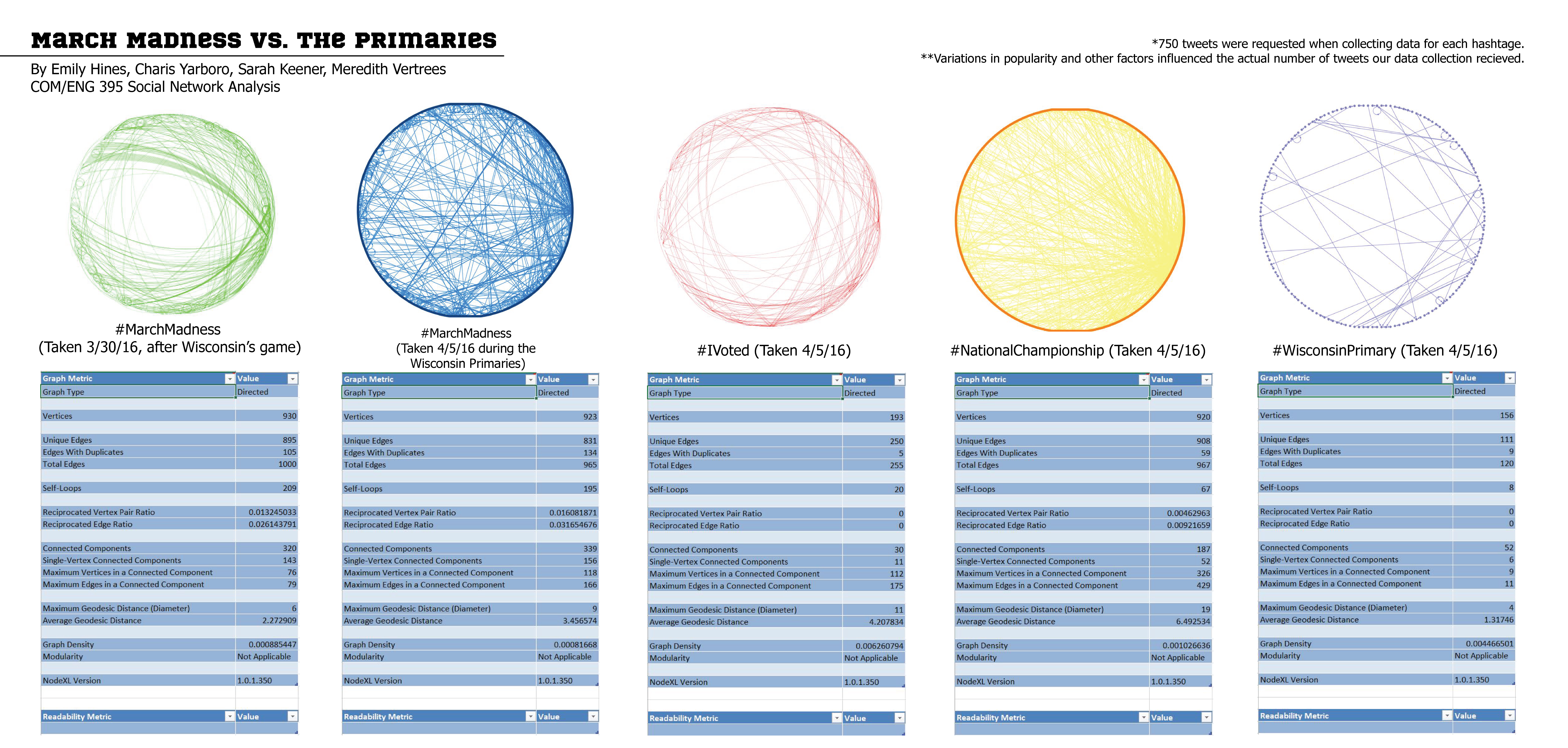
We pulled two identical hashtags for “March Madness” one on the 30th of march and the other on the 5th of April. The first hashtag is looking at the hashtag during the Wisconsin basketball game, while the second was the same day after the national championship as well as the Wisconsin primary. The original motive of pulling the same tag for two different days, was to compare the amount of interest in basketball during and before political events. However it is difficult to make these broad stroke comparisons with limited data set. Google trends tells us the peak in interest for march madness took place on march 17th, when the largest amount of teams were participating in the tournament. One of the lowest points of interest was in the span after the elite 8 and before the final four game, from march 29th to April 1st. This lull in interest can be justified through the two hashtag graphs, with the green housing a lower rate of connections and duplicates than the blue graph. Because of the time restrictions on retrieving data from the Node XL program in our graph shows that twitter data reinforces same pattern of interest as google trends. Interestingly enough Madison, Wisconsin was the main contributing city to the March madness searches, which could lead us to conclude there is a large interest in basketball in Wisconsin. Though the data does not allow us to answer our question fully, it reinforces the data that google trends has cultivated. [Link to Google Trends Search]
People often use Twitter to show their enthusiasm or interests through an online platform and our group was particularly intrigued in how many Twitter users would tweet with a #iVoted or a #NationalChampionship. The tweets collected between the groups were both taken on April 5, 2016, the day of the Wisconsin Primary and the day after the NCAA National Championship basketball game. We thought this collection date for the tweets would be particularly pertinent because people would likely still be upset or thrilled with the results of the Villanova win over UNC-Chapel Hill and want to tweet about it. Also, Wisconsin residents voting the day of April 5 would be unlikely to tweet with the hashtag #iVoted any other day beside April 5. The championship game featured Villanova beating out UNC-Chapel Hill 77-74 in a close match that we thought would likely mean lots of tweets with the hashtag #NationalChampionships: which was definitely the case. Not accounting for voters or basketball viewers that don’t have a Twitter or used different hashtags, we noticed there was a substantial number of tweets more for the hashtag #NationalChampionship represented in yellow than the hashtag #iVoted represented in red. The red graphic features a mere 193 vertices generated from tweets about the Wisconsin primaries and the yellow graphic for the National Championship, by contrast, features 920 vertices generated from tweets. There may be a reason for the difference in number of tweets: the #iVoted hashtag would be more important only to Wisconsin residents on April 5 in particular whereas anyone in the United States could have tweets about the Villanova win on April 5. Still, just looking at the two graphs leads a viewer to think that Twitter users didn’t care as much about the Wisconsin primaries as much as they did the NCAA Championship.
One poignant comparison within our social network graphs was between the “MarchMadness” hashtag from 3/25/16 and the “WisconsinPrimary” hashtag from 4/5/16. This was a fascinating comparison because of what it revealed about human nature. We were interested in exploring if there were differences in interest and participation between a major sporting event and a major political event via certain hashtags used on Twitter. In order to keep our comparison as accurate as possible, we evaluated two different hashtags that were relevant to a single state. This lead us to examine the quantity of “MarchMadness” hashtags on the day that Wisconsin played Notre Dame in the Sweet Sixteen, compared to the quantity of “WisconsinPrimary” hashtags on the day that the citizens of Wisconsin could vote in the primary election. It is clear that the green graph, reflective of the MarchMadness hashtags, is much denser than the purple graph, reflective of the WisconsinPrimary hashtags. On the surface, this comparison exposes the greater level of investment that the people of Wisconsin have for a frivolous sporting event, than they have for the potential role they have in choosing who will become the leader of our nation. However, there are definite shortcomings with these graphs, including the possibility of not having an accurate sample of the actual quantity of voters. The stark reality is that not everyone who voted in the Wisconsin Primary made a tweet about it, and to go even further, not everyone who voted in that primary would have used that direct “WisconsinPrimary” hashtag. Another shortcoming includes the fact that the green graph may have been denser because multiple games were playing that day. UNC was also playing Indiana on March 25th, 2016, which could explain the influx in “MarchMadness” hashtags, since two games were playing on that date, while only one Wisconsin Primary was occurring on April 5th.
According to the Pew Research Center, republican voter turnout has hit historical record highs, surpassing the previous high during the 2008 elections. Democratic voter turnout has diminished in comparison, but over all, turnout remains high in comparison. With the nation’s leaderships at stake in these elections it makes sense that this topic would be highly covered and highly talked about over social media. However, as we can see from our graphs above, the number of tweets pertaining to politics is vastly outnumbered by those about March Madness. During our data collection, we made sure to ask for 750 tweets for each hashtag. However, we did not always receive 750 tweets. According to the New York Times, over two million voters came out to cast their ballot during the Wisconsin primary on April 5th. This is roughly ⅖ of the population of the state of Wisconsin and 1/161th the population of the United States. This alone would explain why the graph for #IVoted is more dense than the graph for #WisconsinPrimary. However, yet another factor to this is the popularity or inclination to use one hashtag over the other. The inclination or popularity of a #hashtag is surely evidence of it’s popularity in everyday life and pop culture, making it safe to assume that people have one hashtag on their minds more than another.
 Previous Post
 Next Post